Saturday, 29 January 2011
Wednesday, 26 January 2011
Type Analysis
Logo type faces
| This brands logo works with type for the name and the imagery. It is a medium weight font with circular curves throughout. I think the font works well because it portrays the feeling of elegance and class, as is the brand. The serifs make the font look powerful and the curves throughout the 'g', 'u' and 'c' help to make it look more feminine and approachable. |
Clever Logos


All of these logos have come a long way since they were first designed. Generally as the companies have become more famous they don't need to have their brand name on the logo because people can simply recognise them from simple imagery.

 |
| This logo says 'noon' is the use of two horizontally placed '2's. It uses digits disguised as letters. Because they are in fact 2's instead of 'n's your eye automatically follows the shape of the number two, which can be quite straining on the eye. Even though the logo is very visually appealing, it is not very clear as to what the brand is all about. |
 |
| This logo uses mind tricks to make your eye fill in the blanks. It draws your eye in to try and make out what you are in fact seeing. Once you have figured out the logo it is very hard to think backwards and see it how you once did. |
 |
| Again this is a play on lettering and it makes your eyes fill in the blanks. It is all to do with the leading. The logo works well because it is bold and in caps lock to relate to the seriousness. |
 |
| This logo uses type as imagery making the legs on the individual letters become the bandages on a 'mummy'. The fact that the type face is bold, white and condensed works well to help create the effect of lines from the bandages. The 'y' is a key letter as it has been extended to represent the end of the bandages. |
 |
| This logo has used the relation between twins and the number two, tilting the number two on its side to represent the letter 'n'. The '2' has had serifs added to the left leg to accentuate the fat that it is a 'n'. I feel the colour and typeface of this logo haven't been considered greatly when being designed. The logo could work better possibly with a more childish/ handwritten style typeface... |
 |
| UP - This font uses the integration of letterforms to create both an image and a logo. To make it more obvious that they are the letters 'u' and 'p' where the bottom of the leg of the 'p' meets the curve of the 'u' the corners could be sharpened to emphasise the joining of the letters. |
Developed Logos


All of these logos have come a long way since they were first designed. Generally as the companies have become more famous they don't need to have their brand name on the logo because people can simply recognise them from simple imagery.
 |
| I really don't like this logo design. I think it gives of completely the wrong idea. At a glance the image logo looks like it is something to do with an airline or a motorbike company. It doesn't portray elegance and women's fashion because there are no feminine curved lines and the image logo relates too closely to silhouettes of other objects. |
 |
| I really like the look of this poster however the hierarchy isn't very well thought out. The title 'love what you do' is all you can read form a glance and to many people wouldn't mean anything. You need to know what it is advertising in order for the audience to be further engaged. |
 |
| This logo design gives of completely the wrong idea. From a glance I would think that it is for a juice company or some kind of fruit company because of the use of the lemon, whereas it is actually the corporate identity for a Mexican food restaurant in New York. |

 |
| This poster is far too cluttered and cramped. I understand the designer wanted a lot of blank space however it has now been made far too hard to read all of the text that he has put on there. The line spacing is really low and so the text overlaps one another. |
 |
| This looks like quite a cheap design job. All of the type is the same size and the type that is a different point size is so small it is not readable. There are black strips across the page which slightly confuses me as it looks like bits of information have been taped out and so I am not getting the full story. It is therefore not an event I would want to go to because what if the important information has been taped out? |
Tuesday, 25 January 2011
Kap10KURT - DANGER SEEKERS
Audio Example.
This example is quite fast paced and would give a more 'cutting-edge' feel to the whole top 10.
I think it would sound nice with a woman's voice commentating over the top as to what the show will be about.
Fullah Sugah - Soundtrack
Regarding the music style I think something like this would work well. Something unrecognisable with a strong beat. I don't particularly want to use a song that people will recognise because then the focus will be taken off what they are looking at. Sound like this is mellow and chilled out.
Fashion Show Dirty - Carolin Sellman
http://www.carolinsellman.se/#367422/Fashion-Show-Dirty
I really like the music and movement to the movie. It shows a lot of personality and class.
This style would work well for my project. Using shapes to show only parts of the garments and added patterns to give the movie movement and depth.
Here are a few snap shots and at the top of the post is the link to Caorlin's site.


Cheek Magazine
http://www.cheekmagazine.com/archives/Issue4/
I really like the motion graphics at the start of the website. I like the way the block colours expose into images of models. It is a very soft and romantic feel and it draws the eye in as the shapes are moving out behind the camera frame.
Here are some quick snap shots of the start up page. The website link is at the top of the page.


Nadia Cheema

I love this piece by Nadia Cheema. It is so pretty and would be perfect for a background on my movies.
Make-up Close Up
I like the way the woman is portrayed. Beautiful, elegant and as an icon. My ident should make viewers want and inspire to look like the models and have the new trends.
This woman is not shown as a natural beauty and fashion can be seen as a mask as well. trends aren't necessarily about what you like it is about making the crowd follow you instead of being the crowd following.
MTV Ident
I love the colour for the background it creates a fantasy feeling. I think these colours would work well for my animation because they are feminine and elegant but would also work well with dark sharp colours on top.
Angles and Colours
I could use angles such as these, with the models shown coming in from the side and coming towards and past the camera. It crates a new angle and perspective making is visually more interesting.
Burberry Advertisement
Beautiful Burberry Ocean : http://www.youtube.com/watch?v=hiMWrEe7nUk
Burberry Brights: http://www.youtube.com/watch?v=-KMsnCyy6Sw
Burberry Winter: http://www.youtube.com/watch?v=hlOA2x8IJ2k
I like the styling and the techniques for the overall feel of these videos.
Burberry Brights: http://www.youtube.com/watch?v=-KMsnCyy6Sw
Burberry Winter: http://www.youtube.com/watch?v=hlOA2x8IJ2k
I like the styling and the techniques for the overall feel of these videos.
Adidas
Amazing design ideas looking at perspective and 3D art.
Photoshop can help to create a hyperreality. Advertising something doesn't always have to show reality and can show an idea of a perfect reality.
Each colour shows a different style shoe and how it is represented in society. For example the brown shows the city and the style with the show being the 'world' and the base for all of life.
Ebay Viral
Making things move that should move... the images on the paper create part of the screen and are able to be scrolled.
The tennis ball is a good example of how you can make things appear which aren't actually happening - the ball appears to be coming out of the paper/web screen.
Beautiful Stop Motion
I think this is a really elegant and lovely pice of stop motion animation. It tells a story through such an easy method of lying on a bed. It plays with perspective by making it look like she sis standing up where she is actually laying down. It creates a distorted and quite awkward movement. The movie integrates all sorts of little attributes during her day, such as a scarf being blown round her neck to keep her warm.
This is a perfect example where stop motion works well whereas taken in real time this idea would not look the same. Because separate images have been taken for every frame the set is able to move as if by magic every picture.
Saturday, 22 January 2011


Fashion Trends Gone Wrong

 |
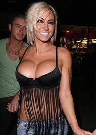
| The 'boobs too big' dress |
 |
| The 'picnic blanket;' |
 |
| Celebrity Perfume |
 |
| Geeky Glasses |
 |
| Hobo Chic |
 |
| Ed Hardy |
 |
| Flip Flop Wedge |
 |
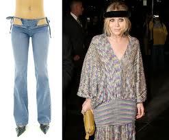
| Tights as Trousers |
 |
| 1 Size DOESN'T Fit All |
 |
| Celebrities Gone Wild |
 |
| Floral Leggings |
 |
| Knickers Showing |
 |
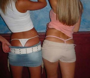
| Belly Up |
 |
| The All In One Tracksuit |
 |

 |
| Kanye West Sunglasses |
 |
| Extreme Hareem Pants |


 |
| Close Shave |


 |
| The 'I Can't See' Hair Do |


 |
| Tramp Stamps |
 |
| Crocs |
 |
| Boys Wearing Huggies |
Subscribe to:
Posts (Atom)