Tuesday 24 May 2011

Magazine - Existing Design Covers

Plain with bold writing

Mainly white with bold centre section, obscure image.

Mainly type orientated with a lot of white space.

Peaceful, bold image.

Gold writing, full page.

Bright colours with image reflecting text.

Beautiful type with soft image and gradient colour.

Bold design identity a lot of blank space.

Eye catching imagery, simple and sleek design.

Sketchbook style. Handwriting and bold image.

Pattern design with band across with title. Bold image and type.

Beautiful design. Colours blend well together and type over image catches the eye.

Bold clean logo. Lines draw the eye down the page.

Eye catching design. Black and white with red font to make the brand stand out on the shelf.


Over all the design magazines have very eye catching and bold identities. They all use type and image. For my magazine I would like it to be sleek, elegant and simple.

As more can be less I am going to only use type on the cover. The white space in itself will help the magazine stand out on the shelf against the mix of colours use on other magazines.

Magazine Covers - Do they stand out on the shelf?


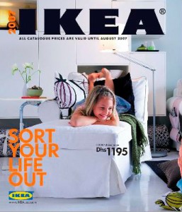
I have tried to show some of the more eye catching cover designs that I have found to show what I am competing against on the shelves. The majority advertise the contents on the magazine cover to further inform and entice the customers to buy their copy. The luxurious style I wish to portray in my magazine range will have to be evident throughout. This will be produced using types of stock, perforations and different stock.

Because the magazines use a lot of colour to entice customers, I thought the best way to stand out on the shelf is to use one colour. It will really stand out against the rest of the type and image bombarding the audience, and will be a clean change and a chance for the customer to rest their eyes on a plain and clear WHITE cover.